
I have known and loved Lisa Sanditz’s paintings for more than a dozen years, so their cadences and syncopations are familiar to my body. If you happen to be new to their magic, monitor your responses closely: their meanings and pleasures reveal themselves in waves.
You’re likely to be startled first by the convulsive contrapuntal energy they transmit. Absorb the colors’ disconcert, register the exuberance, but pay attention to the contexts. There are explosions of color among vast swaths of despoiled space; precise, atmospheric descriptions of light cut through with the insistent afterglow of murk. Consider, then, the physical, material presence of the paint: opaque, viscous fluids sitting atop swirls of runny, transparent terrain; quirky, blobby, unselfconscious image shapes coalescing into all manner of confrontation—between the world as we find it and the things we choose to inflict upon its surface: farms and warehouses, smokestacks and server farms, toxic orange fields, lakes filled with thousands of black balloons.
Sanditz’s paintings reflect back the evidence of us marking our ways everywhere on the planet—planting, occupying, extracting, producing. Consumption courses through each of these landscapes, equal parts disease and desire, radiating anxiety, tenderness, and optimism in lucent, dirty, pretty presences infused with disappointment and wonder but speak, resolutely, of light amid the darkness.
Lisa Sanditz We are in Kanishka’s studio in Brooklyn. He made lunch for us. A delicious lamb and rice dish—
Kanishka Raja —with spinach.
LS And cardamon, and other spices. This is a perfect setting for us, as we often eat together and talk about painting.
KR That is basically our friendship. You’ve just come back from this somewhat off-the-grid adventure in California. Much of your early work was located in and inspired by this region, right?
LS Yes, California is equal parts problem and inspiration.
KR The paintings I’m seeing now seem a lot more complex—physically, in terms of their geometry and the way the space is arranged. They are also more layered. The play between intensely chromatic, dense colors, and murky or transparent and luminous ones, is more pronounced. Let’s start off by talking about color.
LS Lately, I’ve been thinking a lot about light, and how to translate that into color—the endurance of light and how profound and timeless it can be in painting. Think of the light in Hopper’s paintings or Caravaggio’s, or even the flatness of light in early Renaissance painting, like in Piero della Francesca’s.
Living in close proximity to a photographer—my husband, Tim Davis—makes me very aware of light. And as someone from the Midwest who has spent time on the West Coast, and who now lives on the East Coast, I see how light totally defines things: the landscape, mood, expressiveness. Western light so articulately describes edges, drawing thrilling lines between highlight and shadow. You can’t not notice it.
KR I would add to that trajectory your move from urban New York City to upstate, the territory of the Hudson River School.
LS Of course, the light in those paintings is delicious.
KR You’ve made landscape paintings in one way or another for many years, and in them there’s obviously an undercurrent of the conversation between human intervention and landscape, between production and nature. I wonder if your heightened, almost exaggerated colors and sense of light is driven—not necessarily in particular paintings, but in all of your work—by a desire to highlight some aspect of that relationship.
LS It’s different in each painting or body of work, but I certainly think about that. I did a painting, Shoe City, based on the single-industry factory towns in China, in which the painting’s physical landscape is somewhat washed out or desaturated in response to the particulate matter in the air, but also in response to the notion that maybe the landscape is secondary to what’s being made in the factories. I painted some of the billboards and factories with more saturated color—calling attention to that plasticity and artificiality, and also to the epic scale of it all.
Other times I’m calling attention to things occurring naturally or highlighted by natural light. I’m thinking of what is sanctioned as beautiful, like a national park, for example. In your talk at the Fatal Love conference at the Queens Museum this year, you spoke of the notion of the ideal landscape. That’s something both you and I are examining. For me, maybe it’s thinking about national parks, or the nonideal in the quotidian or overlooked, like shopping malls or reservoirs, or even the silly visual circus of pest fumigation tents; for you, maybe, it’s thinking about representations of landscapes in film or painting.
KR In both our works, color is foregrounded; for the viewer, the result is an immediate formal engagement with color. But underneath is a much deeper engagement with what is being represented, and how we, as painters, are representing it, right? There is a conversation between the color palette of the work and its underlying philosophy. In my own practice, color takes on a declarative position. I see a kind of chromaphobia that runs through modern Eurocentric, Western visual culture—color denotes something lurid, less serious, while the absence or the restraint of color is seen as indicative of a deeper intellectual engagement.
LS I suppose.
KR I mean that these are the assumptions I detect in the culture at large. In fact, a few weeks ago, I found a reference to a review by Roberta Smith in which she very offhandedly mentions how the absence of color in the exhibited paintings denotes a seriousness in the work. This, to me, is a perfect example of how entrenched that suspicion of color is in Western culture. And if you combine that suspicion with the relentless stereotypes about the Indian subcontinent and its use of color, for an artist operating from my position, there are two choices: complete abnegation or aggressive reclamation. I decided very early on that I was going to choose the latter: reclamation. You want color? I’ll fucking give you color. And I’ll give it to you in ways more confrontational than you ever expected—with the hope that it acts as a destabilizing force.
LS It turns on itself.
KR Right. Color acts as a destabilizing force in your paintings, too.
LS I hope so. As soon as you said “lurid color,” I immediately thought, Otto Dix! Dix was a painter who used color for emphasis—look at these saturated lips, or this tight shiny dress—and turned it in on itself.
KR Yeah. Maybe painting in Germany and Austria from that time remains an exception in modernism, but I feel like some of that was also connected to the discovery of new chemical palettes for painters, a wider range of available colors. Notice how quickly some of that got sidelined and how Analytical Cubism—it’s in the name, it’s more analytical—steamrolled over all the “cheap” pleasures of color.
LS But part of that is what you see, right? What you choose to see or what you record in your consciousness. I grew up going to museums and seeing a lot of paintings—so I have countless images imprinted in my mind, and perhaps it’s my own proclivity that many of them are fairly saturated or chromatic. I consider myself a chromaphile, not a chromaphobe. You might be one, too.
KR (laughter) Yeah!
LS I make a lot of conscious decisions while painting, but then there’s also the magic that just happens within the work, in reaction to a shape or a color on the palette, or in response to something I saw. I feel like color combinations are inside of me, and they have to get out. In the studio, I try to make them sync with what I’m working on. Sometimes, certain colors linger in my head for a year or two.
KR They are recorded in your brain somewhere. It’s not dissimilar to how other artists operate—you find certain things in the world or in your mind, and then you wait for the right moment to deploy them in your work. Like a filmmaker or a writer hearing a piece of dialogue that she might store in her head for years until she finds the scene in which to put it.
LS I like that parallel. But I try to make the color emerge from the feeling of a place. Other times it may be more arbitrary, especially if a place is filled with contradictions. I come from a suburban world of corporate logos, standing amid the taupes and ecrus of the commercial landscape. The suburbs are increasingly a natural wonderland, with bears and coyotes venturing into these banal places. Many of the homes in the St. Louis neighborhood where I grew up have been replaced by enormous homes of hideously eclectic design. It’s like a secondor third-growth forest of suburban homes. They stand there festooned with fake rocks and bricks, and just beyond them, corporate signage erupts in striking colors. I grew up in a landscape of what Robert Venturi and Denise Scott Brown refer to as “decorated sheds.” In springtime, a variety of natural colors pop up, but the giant swaths of red and blue advertising fill the landscape with high-keyed chroma all through the year. In my work I tap into this tension of the natural and the man-made through the colors I use, and sometimes by literally putting signs in the painting.
KR So color, surface, and viscosity reflect the narrative relationships you are implicating. For me, a painting succeeds when its materiality is able to manifest or carry a large part of its meaning.
LS And these decisions are a counterpoint to something more didactic, like issues of land use or even more personal things.
KR Right. Some of these choices have to happen in the performance of the work, so to speak—in the studio, in the moment—even though I’m sure for you, as for me, revision is an important aspect of painting. That’s what makes painting work. Unlike in other pictorial media, those decisions are so palpably on the surface and crucial to the way the meaning of the painting unfolds for a viewer.
LS Yes. I generally visit the sites I am painting and bring that visual, narrative, experiential data back to the studio in photos, sketches, and memories. Then I try to make a painting by synthesizing the information and carrying out formal decisions that address the site I am thinking about. The painting builds out of this information, but it also reacts to what’s happening visually on the canvas. For example, I’ll start sketching a large reservoir in the middle of the city of Los Angeles, or on the Texas-Mexico border, and then the paint and I have a wrestling match back in the studio.
KR The relationship between the man-made and the natural; between global, capitalist production and its aftermaths—you engage with this subject matter in all of your work. Tell me about this new painting, Southern Border Pink. I’m very taken by this one.
LS It’s from 2016. For the last fifteen years or so, I’ve been trying to make landscape paintings that respond to the places I go and the things that I use, like food, water, clothes, roads, and so on. So, I may get an idea when I’m driving to the shopping mall, or by seeing the water storage tanks in the California desert. I’ve even gone to China to visit factories where things that I use and wear are made. More recently, in the last year, reading the news, I’ve noticed that the discussion around landscape has become dominated by talk about borders. As a landscape painter, I wanted to address that. So that’s what my two paintings, Southern Border Pink and Northern Border Blue, do. But I also feel like they started getting further away from my personal experience interacting with the landscape.
KR Did the subject feel more outside you?
LS Yes. For Southern Border Pink, I went to three different southern border points in Texas and Arizona. In the painting, I wanted to convey a sense of how desolate the landscape is—it’s dry, arid, impossible, barren; there’s nothing useful there. So the color and lack of any structures in the painting aim to get at that.
I built up the surface of the canvas with six to ten layers of different colors, and then sanded them back to reveal this history underneath. I was thinking about what underpins a landscape—water. I’d been reading about microplastics, these tiny, colorful bits of plastic debris that are infecting waterways and getting caught inside animals’ bodies. There are things occurring in the landscape that we see, and then there are things that we don’t see. I began incorporating some of these hidden aspects, thinking about how they tie everything together.
KR Your new method of deliberately building up the surface, then sort of excavating it—is it making visible what happens to any particular landscape?
LS Yes. It is an excavation, a subterranean scar. Breaking up the surface of the painting gives me more space to respond to. It’s similar to what you do in your work, when you make patterns and react to the surface, conceptually setting up a formal space to move around in.
KR Building a history with the plan to dig back into it so that it will reveal a more complex surface—
LS —and color. Saturated color.
KR And revealing the scarring and disruptions on the surface of the painting.
LS And in the landscape itself. Many of these paintings were a big song and dance to resolve. I’m not even sure they are resolved.
KR Let’s talk about Palisades.
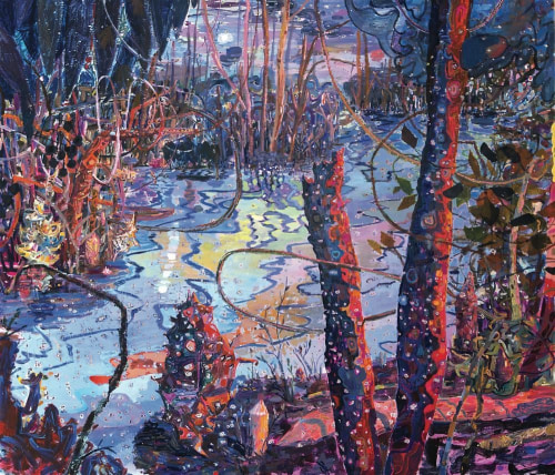
LS It’s a painting of the Palisades reflected in the Hudson River. It’s the huge waterway I live on and am intimately and physically connected to. There used to be a lot of commerce on the Hudson. There’s still some, but now it’s also used to shuttle trash.
KR I’m going to pretend for a minute that I’m seeing your work for the first time. Hearing that description, I want to say: I love how naturally you talk about the Hudson. In the painting, I see water, and here is a reflection of the cliffs and a building, and I’m looking at this thing where there’s no blue whatsoever, or almost none. It’s shockingly parrot green and there are bright oranges and reds and purples. You are really close to your subject in terms of what it is, but you also allow yourself to veer as far as your imagination or invention will let you go in the studio. This is not anybody’s first thought of an image of cliffs and buildings—
LS —Hey, look at my painting of the Hudson River!
KR It’s a giant orange lozenge in a green field! (laughter)
LS Well, the choice of colors came from this sense of a bright, exuberant, plastic toxicity everywhere. If you set that as a parameter around the painting, anything goes! The local color is green, and the sky is blue, but there’s all this other information below the surface and in the air that has a different color and represents a toxicity that is changing this environment.
First I painted the cliffs a soft orange color, which I’d seen from the train along the Hudson. Even though the rocks are gray, when the eastern sun hits them, they’re orange. But the color in the painting looked flat and boring.
KR The orange light may have been beautiful on the cliff seen from the train, but it’s dreadful on the painting.
LS Dreadful would have been exciting. It just looked snoozy.
KR Yes. The worst—the most damning response—would be that it’s just boring. Uneventful.
What happens when you start working with unfamiliar materials, materials in which you’re not as deeply practiced? Your show Surplus at CRG in 2014 in New York included ceramics.
LS For that show, I handmade a five-gallon bucket from stoneware and porcelain, fired through the kiln. The found objects on it I collected in the Gulf of Mexico off the coast of Texas—weathered objects that have floated through the ocean and landed back on the beach.
KR Are they mostly man-made objects?
LS There are a few seashells, but they’re mostly bottle caps; there’s a little toy, and a golf ball.
KR Are the ceramics a diversion for you or an adjacent practice?
LS I started working with ceramics a few years ago because I was frustrated with painting in acrylic. How the paint moved around on the canvas had become too predictable, and I was relying on too-familiar moves. I then moved to oil, but got frustrated with it, too—it dries slowly while I move quickly. As a result, many of my oil paintings became a big brown mush. So I started working in clay, seeing where that would lead me.
KR Had you worked in clay at all before?
LS Not since high school. The ceramics I showed in my exhibition Surplus were these organic cactus forms, and I put them in found containers. The newer ceramic pieces I made in response to reading about plastiglomerates—
KR —Wait! I have to interrupt and say that I’m already frightened.
LS (laughter) It’s the latest geological term for a rock consisting of plastic and sand that has been burned on the beach, churned through sand and water, and formed into matter hard enough to be considered a solid rock form. I was interested in its hybridity—like I am in my paintings—the relationship between the artificial and natural. At the same time, I learned about Fordite, also known as Detroit Agate, which is a prismatic sedimentary artificial rock formation, formed in automotive factories back when cars were spray-painted by hand. It’s made of layers of oversprayed paint that would build up on the tracks and skids, getting baked hard over and over, until it had to be removed and discarded. The cross sections are spectacular.
KR It’s like a perfect metaphor for your work.
LS Yes! So I tried to approach plastiglomerates in painting and wondered, If the artificial and natural are collapsed, can these other conventional ideas—binaries about space—be collapsed, too? Figure, ground, subject, object? I tried it, but most of the paintings just looked weird, and it was hard to understand what was happening in them—which was kind of interesting, and I could have pushed that, but ultimately I thought, Why don’t I actually use natural things, artificial things, physical things—
KR —and glom them together.
LS Exactly. For Nest, I built this clay slab and base, and then I peeled the rainbow-y skins off of CDs and adhered them onto the surface, making it a reflective, wavy rainbow—with a little tree and an actual bird’s nest. For me, this piece and the bucket have the richness and complexity that I was hoping for.
KR You made this material fit into your visual vocabulary quite easily. As in, they don’t look like objects made by some other person. They’re very much Lisa Sanditz objects.
LS Well, my hand is all over this stuff.
KR Are the ceramics a one-project experience for you?
LS I loved making these objects. I have other ideas for a different project with clay. I just have a backlog of paintings that I want to do right now. The first ceramic work that I showed took me a year and a half to make.
I was thinking about something you said in a conversation two or so years ago, when you began working with embroidery and weaving. You said something to the effect of, when you only use paint, the virtuosity of painting is so much more prevalent or important, while the use of these different materials moves the conversation away from this virtuosity.
KR It diffuses it.
LS At that time, I was like, Aw, I just want to go deep into the paint! But after seeing your work combine all these materials, I felt you’d kind of got it all. The painting is actually more—
KR —painterly!
LS Painterly, lush, saturated, and virtuosic at the same time that you have these fabric pieces.
KR Diffusion is built into the work, but it’s not the intention. The intention was to find a way to make images that involve painting, but that also incorporate other methods of picture-making that are equally complex, deep, and rich in their histories, but not necessarily afforded the same importance. I grew up around textile traditions, around embroiderers and weavers. My parents are textile designers, so the language of ornament, and of weaving and printing in particular, is deeply embedded in my experiential DNA. It’s always been a mystery for me why painting is considered superior, while at the same time, I see the immediacy of making paintings as deeply unique and totally different from everything else.
LS That’s a beautiful description of the contradiction. Of course I recognize that this hierarchy exists in Western painting.
KR What’s your relationship to the decorative—to patterns and ornaments?
LS For me, if a decorative element or pattern is unique or has agency, I am taken by it. I am as taken by the pattern in a sun-bleached vernacular poured-concrete fence as I am by hand-printed Victorian wallpaper, Roman micromosaics, or the flittering patterns in Vuillard’s paintings.
KR Do you intend for cultural markers to be recognizable in your work?
LS In my newer paintings, I’ve tried to get as far away as I can from indicators of human intervention, such as billboards, highways, structures—to see what the paintings would carry without them. So now there are very few indicators of the built environment. My painting Upstate Swamp is just trees with some beaver damage as a way to introduce invasiveness, some leftover fence, and there is a rainbow-like reflection off of the oil-slicked surface in the puddle.
KR I see the landscape starting to dominate the built environment in your paintings more and more, even though, in some, there are still allusions to automobiles, parking lots, and stuff like that. Does the landscape taking over signal a sort of reclamation—as in, the landscape itself is artificial?
LS This makes me think of the book The World Without Us by Alan Weisman, and about our urge to try and contain nature. The idea of a border as a wall on a two-thousand-mile expanse seems so—
KR —absurd?
LS Absurd, impossible, and unnecessary! I’ve thought about this reclamation, nature pushing back, for sure. A lot of the things I’ve painted don’t exist anymore.
KR Really! Already?
LS Yes, I’ll google sites I’ve visited, and all that pops up now is my painting because the thing isn’t there anymore. And I’ve only been doing this kind of landscape painting for fifteen years!
KR Well, this, I feel, is characteristic of the experience of entering into, wandering about, and then exiting a Lisa Sanditz painting—you’re going to come away with wonderment and exuberance, but you’re also coming away deeply saddened by the reality we live in.
LS Well, that’s what it is—life is amazing and exciting, but a lot of how we design and experience place is painfully misguided.
KR Earlier you used the words “bright, exuberant, plastic toxicity.” I feel like that describes your entire practice and perhaps, the entire world.
LS And the world’s toxicity levels have recently reached a crisis level. Everyone is swimming in muck and trying to grab onto something solid. I have started drawing people for the first time in fifteen years, specifically my own family—a family that formed through loss and love, and ultimately through adoption—and also other friends who have “nontraditional” families.
KR This seems like something of a radical departure for you. Do you see it as a turn inward, so to speak?
LS Well, I think many of us are trying to figure out how to make art and be in the world after the crushing blow of the election. I still think that the content of my work, in terms of landscape and issues of ecology and development, is as relevant as ever, but I’m particularly open to new subjects right now. I’ve felt especially close to friends and family as a result of the election, and concerned over everyone’s health care and civil rights. I’ve been working with that and making postcards addressing these concerns and sending them to politicians.
The drawings I’ve done of friends and family in their homes and daily routines give me new information to formally work with and to open a different dialogue. I’ve spent about seventeen years delving into the complex history of land use and painting through the framework of the landscape. There is a lot of potential in the continued practice of figure painting to include underrepresented people—single-parent families, families with LGBTQ parents or children, blended families, and other ways people organize their relationships. The dynamic, fragile, explosive, loving, and complex family structures hold a lot of possibility for painting to harness and unleash that energy. It’s all very new—navigating the current toxic outer world. I’m trying to resolve, embrace, and reject it at the same time, through painting and conversation, and I’m finding how this plays out in color.
KR You are an awesome painter!
LS Thank you. You are an awesome painter and chef.
Interview by Kanishka Raja